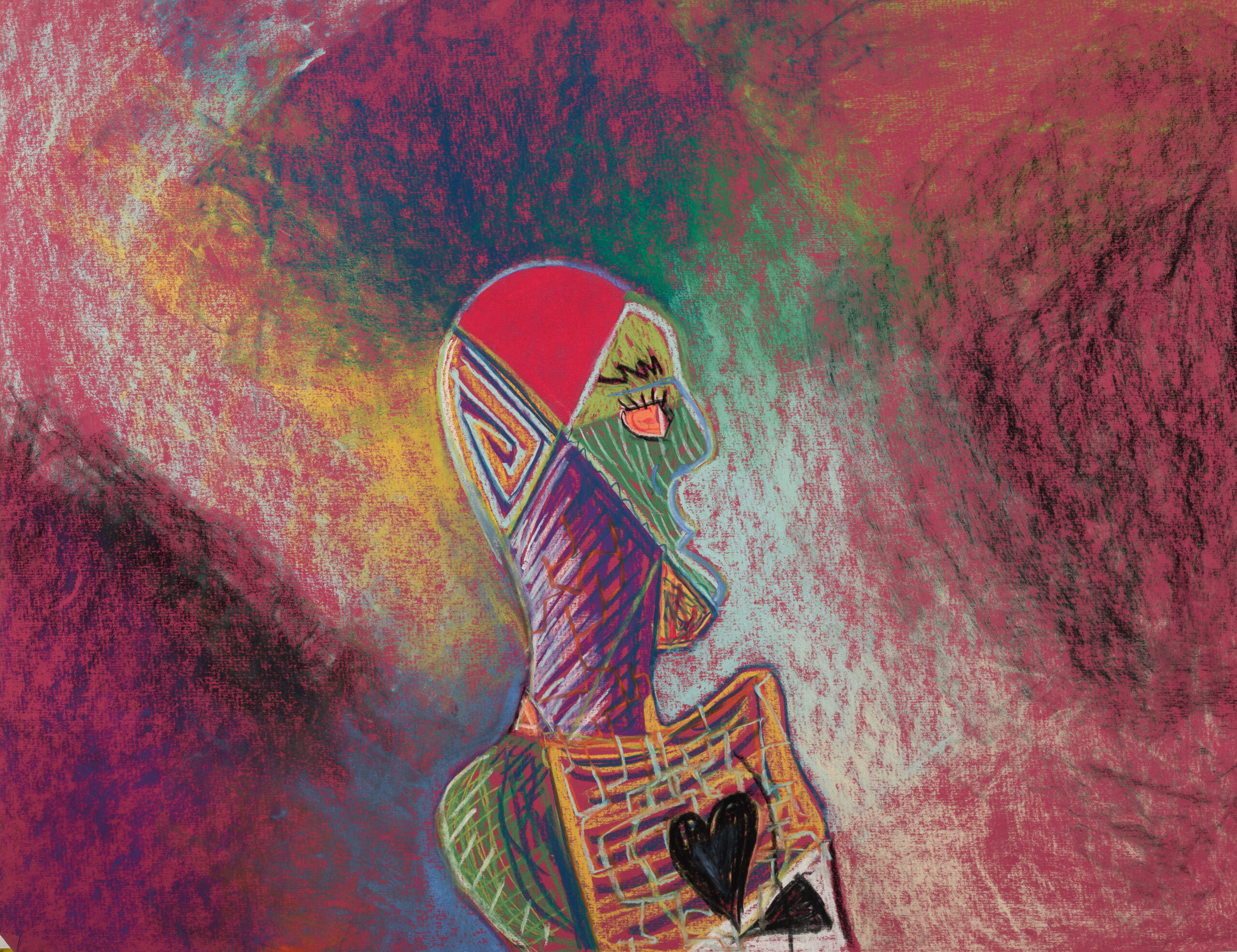
I don't remember making this. I would have been a junior in high school, in AP Art. That is about all I can tell you about the origin.
Pulling it out of storage earlier this year made me look twice. My first reaction was not that this was particularly special. Then it grew on me.
Part of what got me was the composition. There is no reference point in the piece, no horizon, no ground, nothing that tells you which way is up. I could have hung it upside down just as easily. I looked at it both ways and chose this orientation almost as a mini creative expression.
The other thing was recognizing my own hand in it. I have a lot of work from different periods, and when I look across it there are consistent threads: bold lines, compositions that push against the edges, a certain directness and sloppiness in the mark-making. This piece has all of that. Even without remembering making it, it is clearly mine, clearly in the same family as things I was making before and after. That recognition is what grabbed me. It did not feel like something I had discovered; it felt like something I had made, which is a different thing.
Photographed for archival in June 2026. First time it has been shared.
I pulled this out of an old portfolio recently. I had no memory of making it; no idea when, what I was thinking, or why it didn’t have a name. It had been sitting in there untouched for over twenty years.
In the summer of 2004 I was at SCAD (Savannah College of Art and Design) for a summer art program, on an architecture track. I was in a buddy’s dorm room. He’d brought an acoustic guitar. I had just learned “Is There Anybody Out There?” by Pink Floyd, which is a quiet, classical-sounding piece, and when I played it that day it hit me: I wanted to pursue music instead. Not because I didn’t love making art, I do, but because of the way music made me feel. That was the moment.
I went to Berklee after high school. The visual art kept happening in the background, the way it does when something’s yours but not yet public.
Looking at this piece now, it reads like that period. A lot of elements that don’t quite cohere, things pulled in different directions, patched together, not yet resolved. That’s an accurate picture of being seventeen. I titled it “Am I Someone?” because that’s the question I see in it.
I have a folder on my hard drive full of MIDI music memos and rough recordings — ideas I’ve captured and then completely forgotten about. Every once in a while I’ll dig back through it, and something will stop me. Something I made a year ago, maybe two, that sounds fresh and surprising in a way I couldn’t have heard when I made it. I was too close to it back then and I couldn’t tell what it actually was.
I’ve always known this feeling. I didn’t know it had a name until I read the introduction to Ray Bradbury’s The Martian Chronicles.
Written in 1950 right after he turned in the final manuscript, Bradbury’s essay “How I Wrote My Book” was found in his home office files decades later and eventually published as part of the book’s deluxe edition. It’s not long. But it covers more ground than most books do — and the way it moves from one idea to the next is what got me.
He opens with craft. Specifically, the rotation system he built to write the Chronicles over five years. The idea was simple and familiar. Work hard on a story for a week, then file it away for six months. Move on to something else entirely. Finally, come back to it later with fresh eyes, rewrite it. Then repeat until it’s right.
His reasoning is that a story you’ve been grinding on for days hides its true face behind what he called “a mist of prejudice, tiredness, and boredom.” You can’t see it clearly. You’re too inside it. The only way to get the distance you need is to actually walk away — not for a few days, but for months — and let time do the separating for you.
That landed hard for me because the folder I mentioned earlier; that’s exactly what’s happening there. I’m marinating my ideas like a chicken breast in the fridge. The recording doesn’t change, but I do… When I come back, I’m closer to a listener than the person who made it and I can finally hear what it actually is.
Here’s where Bradbury pivots, and it’s seamless enough that you almost miss it.
He starts talking about what happens when a writer tries to produce on a market’s schedule — reacting to what editors want, slanting work toward what sells, chasing formulas. And you realize he’s describing the exact same problem, but one level up. The market is just another form of closeness; another thing that prevents distance. When commerce sets the timeline, you never get to walk away. You’re always in that, all-too-near relationship with your own work, and the authenticity gets squeezed out — not by bad intentions, but by the structure of the transaction itself.
He put it plainly: a writer who starts reacting to what editors want instead of what he actually thinks and feels is “over, done, finished and dead before he starts.”
Before writing anything, he’d ask: What do I actually think? What do I actually feel? What would I be afraid of, if I were dropped on Mars tonight? Not what would make a good story. Not what would sell. What’s actually true for me or for humanity.
That’s the only way you get to personal truth. It’s your balance between your filter and your wonder that makes things personal. Without it, it’s just the entirety of the universe existing. If a tree falls in the woods, does it make a noise?
And then he does it again. Another pivot, even bigger.
He draws a straight line from the individual creative act to human civilization at large. His whole premise for the Chronicles is that Mars is not a crystal ball, it’s a mirror. Whatever people bring with them in their suitcase and their soul, that’s all they’ll find there. The atom bomb follows you. Your politics follow you. Your habits follow you. You can outrun the speed of sound but you cannot outrun yourself.
It’s the same problem. We move fast, we produce, we export, and we never stop long enough to look at what we’re actually carrying. Bradbury imagined an Earth man arriving on Mars with his hot dog stands, his television, and his insistence on business as usual, and watched the whole expedition collapse under the weight of it.
He wasn’t writing science fiction. He was writing about what happens when you don’t let things breathe.
I think about this a lot in the context of how creative work gets made now. The pace of everything — content cycles, release schedules, social media, algorithms — is optimized for volume and immediacy. Which is the exact opposite of what Bradbury is describing. The system he built required slowness as a feature, not a workaround. The six months wasn’t wasted time. It was the work.
I don’t think you have to be a writer for this to apply. If you make anything from music to gardening to software code — you know the feeling of being too close to it. The thing that seems finished when you’re exhausted at midnight looks completely different at 10am two weeks later. That gap is information; the discomfort of the gap is the point.
Bradbury averaged three major stories a year under this system. Three. Not because he was slow, he was also writing fourteen other stories annually just to pay the bills. But for the work that actually mattered to him, he guarded the distance. He protected his own ability to see clearly.
I think that’s the real argument the essay is making, underneath everything else. Not just about writing, not just about commerce, not just about politics. It’s about what happens when you refuse to let anything sit long enough to become itself.
The folder on my hard drive is starting to make a lot more sense.
Ray Bradbury’s “How I Wrote My Book” was written October 17, 1950, and is included in the deluxe edition of The Martian Chronicles.
There is something sacred about preserving a piece of art.
A painting holds not only pigment and surface, but time. Brush strokes, texture, subtle shifts in tone—these are decisions. They are moments. And when we digitize artwork, the goal is not simply to “take a photo.” The goal is to honor those decisions with accuracy.
Over the past 2 years, I’ve refined a high-fidelity archival workflow that allows me to capture artwork exactly as it exists in real life—true color, true detail, zero glare, and full resolution integrity. Whether the piece is framed behind glass, painted in oil with reflective texture, or completely unframed, the result is the same: archive-level clarity and precision.
The Gear & Foundation
My archival setup is built around control and repeatability:
Nikon Z5 full-frame mirrorless camera
NIKKOR Z MC 50mm f/2.8 macro lens (edge-to-edge sharpness with minimal distortion)
But gear alone isn’t what creates accuracy. The workflow does.
Step 1: Controlled, Even Lighting
The painting is mounted vertically or horizontally on an easel. Two softboxes are placed at equal height and equal distance on either side, angled at roughly 45 degrees to the surface. This placement ensures even illumination across the entire piece and prevents falloff from one side to the other.
The lights are balanced at 5500K daylight temperature, creating a neutral and consistent baseline before any color correction begins.
Each softbox is fitted with a linear polarizing sheet. A circular polarizer is mounted on the lens. By rotating the lens filter to counteract the polarization direction of the lights, reflected light is cancelled out.
Glass reflections disappear.
Gloss varnish no longer produces hot spots.
Metallic or textured paint loses specular glare.
What remains is pure surface information.
This allows me to faithfully capture:
Framed works behind glass
High-gloss oil paintings
Heavy impasto texture
Mixed media surfaces
Without polarization, archival photography requires so much comprimse. It wouldn’t allow for high-gloss paint and museum glass framed paintings.
Step 3: Color Accuracy & Profiling
Before photographing the artwork, I set up my camera to all manual settings so that I’m not working with a moving goal post. Then I capture an image of the X-Rite Color Passport and a grey card under the exact same camera settings and lighting conditions of the final photo. Using the calibration software, I generate a custom color profile specific to that session’s lighting and camera configuration.
This profile is then applied in Lightroom Classic to my x-rite calibrated monitor. This allows me to see the truth.
The result is not “adjusted color”—it is corrected color. Whites become neutral. Reds stop oversaturating. Subtle tonal transitions remain intact. What appears on the calibrated monitor matches what exists in physical space.
The goal is simple: the digital file should look indistinguishable from the artwork under neutral light.
Step 4: Resolution & Micro-Detail
The Nikon Z5 paired with the 50mm macro lens produces exceptional clarity across the frame. When viewed at 100% zoom, individual canvas fibers, brush ridges, and micro-transitions in pigment remain sharp and natural.
The Macro lense has a special final glass layer that minimizes aberrations and distortions of the image.
This level of detail is essential for:
Fine art print reproduction
Archival documentation
Gallery submissions
Portfolio websites
The intention is never to “enhance” or stylize the piece. The intention is truth and fidelity.
Step 5: High-Fidelity Export
From Lightroom Classic, I generate exports tailored to their purpose:
High-resolution archival TIFFs
Print-ready files in appropriate color spaces
Web-optimized JPEGs with embedded metadata
Whether the piece is small or large, framed or unframed, under glass or raw canvas, the workflow scales. The lighting geometry, polarization, and color calibration remain consistent.
With Frame
With Frame, Cropped
Why This Matters
Archival photography is not simply documentation—it is preservation.
As artists, our work deserves to be represented accurately long after it leaves the studio. Collectors, galleries, insurers, and publishers all rely on digital reproductions. If those reproductions are flawed—incorrect color, glare, distortion—then the artwork itself is misrepresented.
For me, this process mirrors how I approach product development: understand every variable, control the system, remove uncertainty, and build a repeatable framework.
Light angle. Polarization direction. Color temperature. Lens distortion. Export color space. When each variable is accounted for, the final image stops being a “photo of a painting.” It becomes a faithful digital twin of the original.
If you’re an artist looking to preserve your work with precision and integrity, I’d love to connect.
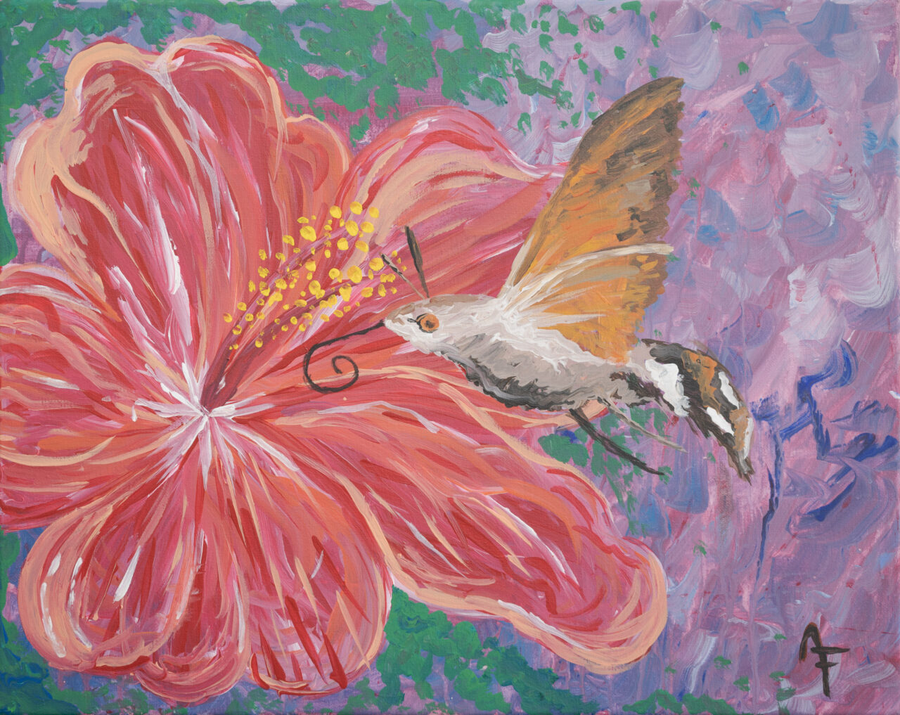
Some moments stick with you, even years later. One of those moments for me was born from the time I spent in my cozy 1-bedroom cottage in Santa Barbara. It was a charming little space, with a back porch that looked out onto a lattice entwined with vibrant morning glory vines. For eight years, I watched hummingbirds flit and dart around the flowers, sipping nectar and bringing life to the garden. But it wasn’t until my final year there that something truly magical happened.
It was late summer, edging into fall, when I first noticed what I thought were hummingbirds zipping around the morning glory—but something was off. These “hummingbirds” weren’t coming during the day, as they always had. They were swarming at twilight, just after sunset. At first, I thought I was imagining it. But it kept happening night after night. Curious, I turned to the internet for answers, and what I found blew me away.
These weren’t hummingbirds at all—they were hummingbird hawk-moths! I had no idea such creatures existed. With their rapid wingbeats and long proboscis, they mimicked the hummingbirds so convincingly that I hadn’t thought to question it. Yet there they were, working the night shift, drinking nectar from the same flowers that their daytime counterparts favored.
This discovery led me down a rabbit hole of research about both hummingbirds and hummingbird hawk-moths. I was fascinated by the parallels between the two species. Did you know that hummingbird hawk-moths are capable of hovering in place just like hummingbirds? And that their wings can beat up to 85 times per second? Watching them felt like witnessing a miracle of evolution right on my back porch.
Hummingbirds, of course, are no less remarkable. With their iridescent feathers and ability to fly backward, they’re nature’s tiny acrobats. They’re also fiercely territorial, which I learned watching them fight each other off from their favorite flowers. Yet despite their feisty nature, there’s something undeniably magical about their presence. They’ve been a symbol of joy and beauty in cultures around the world, and now I understand why.
This story and my love for these creatures inspired a piece of artwork I call “Hawk-moth & the Hibiscus” It captures the moment of connection between the two worlds—the day and the night, the familiar and the mysterious. The hummingbird hawk-moth drinks from a vibrant hibiscus bloom, a nod to the endless cycle of life that plays out in nature if we only take the time to notice it.
I hope this piece resonates with you as much as the real-life moment resonated with me. Nature has a way of surprising us when we least expect it, reminding us of the beauty that exists in even the smallest details.
Did you know that I have a Instagram account where I throw food in the air and take pictures of it? I gained my inspiration for this account because people were posting #foodintheair and the food wasn’t actually in the air… They were just holding it up. I thought, maybe we should actually make it fly. And so, Food Actually in the Air was born.
I don’t know where this project will head in the future, but at the moment it’s fun experiment on capturing that perfect moment where the texture of the food juxtaposes the background and hopefully the emotion of the people in the photo. I imagine it will remain somewhat surreal.
My idea is that eventually the project can be used to gain awareness and funding to fight global hunger. Let’s have some fun while we do it.
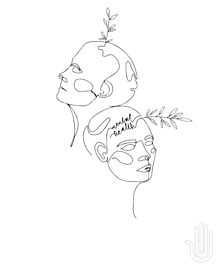
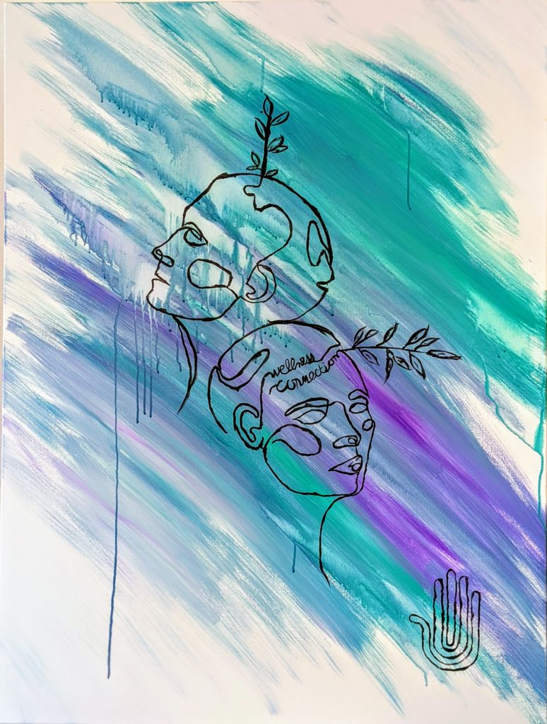
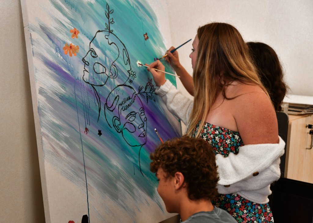
Last year I had the pleasure of collaborating with the Santa Barbara Wellness Connection Council. Our mission was to create a piece of art to display at the annual Mental Health Arts Festival. I was called upon to design a experience for the 9-12 grade kids from SB High, San Marcos, and Dos Pueblos schools to turn inward and contribute to the piece of art by answering the question “What Gives You Hope?”
The Mental wellness Center of Santa Barbara has many programs that target local youth and adults in order to spread mental health awareness. Their Mental Health First Aid program gives the local community the tools necessary to help people having a mental health crisis. The Mental Health Matters program visits local 6-9 grade schools to help educate kids on the importance of mental health and give them the tools to identify mental health issues happening to their friends, family and classmates. The Wellness Connection Council program is a student run leadership program where the students raise awareness and reduce stigma around mental health by promoting self-care, connection, kindness, education, prevention, and outreach amongst their peers.
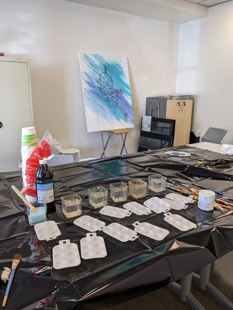
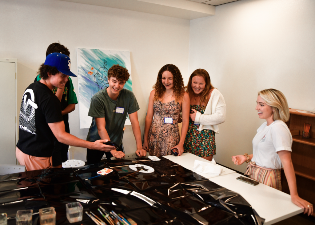
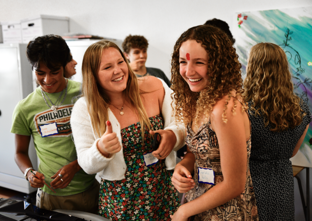
When I was asked to participate in their end of year celebration I jumped to the opportunity to give something back to these kids that are having a monumental impact on our community. I was asked the day of and so I naturally had a very short amount of time to put something together. Let me walk you through my process and share some awesome photos from this celebration
Illustrator Render
First I needed a basis for the painting so I jumped in to illustrator and combined a nice line drawing I found for Mental Health with the Wellness Connection logo. I later replaced “Mental Health” with “Wellness Connection” to make it more fitting.
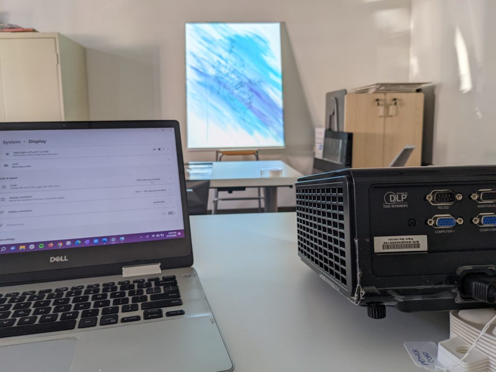
After setting up the canvas with a basic wash of blue and purple, I used a computer and a projector to project the outline of the image onto the canvas.
A word of caution: Since projectors are not capable of producing as much contrast as your computer screen, you might have issues like I did with making the rendering lines too thin. In my example, I added a grid to my render but since the lines were so small, it was impossible to see with the projector. Luckily my image was thick enough to see on the projection.
The canvas is now ready for the kids!
Next comes the fun part. After a brief explanation, the kids were excited to jump in! At first they were a little nervous about perfecting their contributions, but after a little encouragement and fun, they had a blast making the piece of art their own. It was such an incredible time.
I decided to create and share my first artwork. The title is “Spirit and Body”. This piece arose out of friction and pressure I was feeling from outside sources to reveal personal medical information. I contemplated my own boundaries and realized that my privacy begins at my spirit and body. This piece encapsulates this boundary.